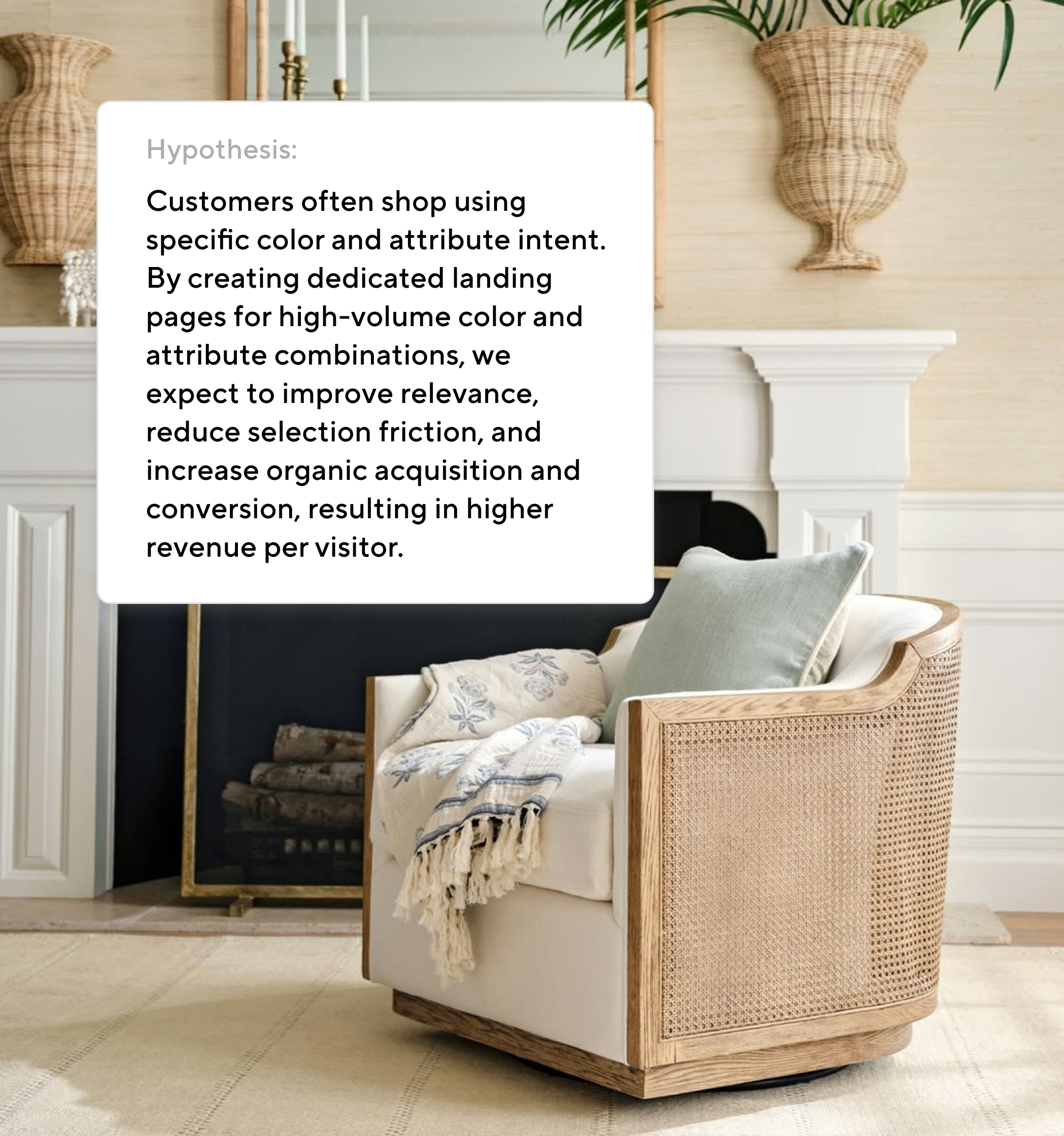
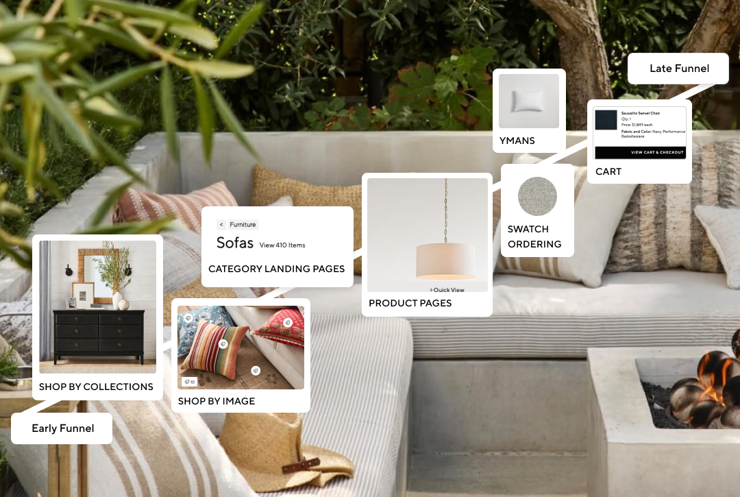
What decision or action is this user trying to make, and what is getting in the way of it? Every design choice flows from that question. Typography, spacing, hierarchy, interaction each one either reduces friction toward that action or it doesn't. Taste is the mechanism, not the goal.
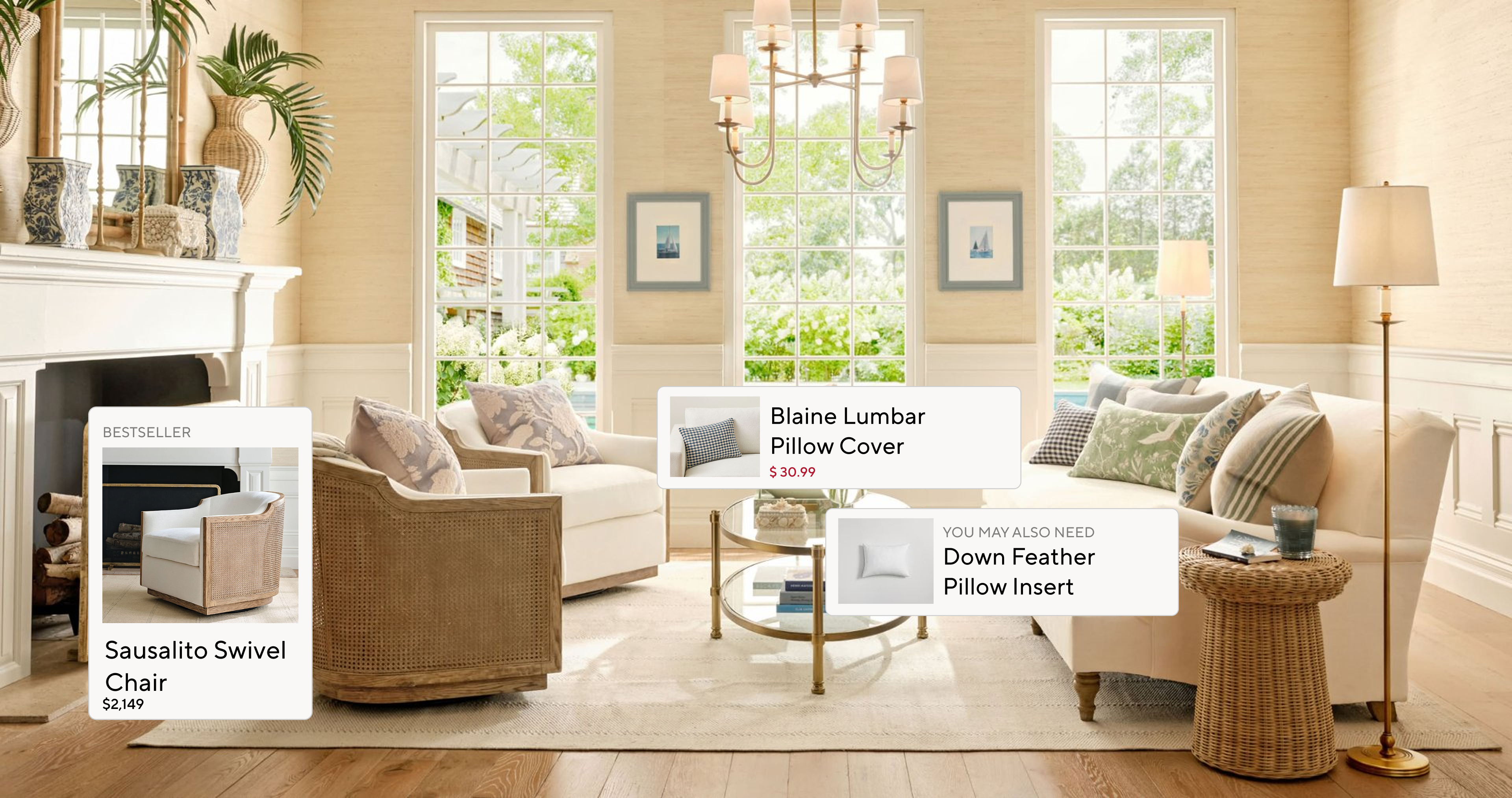
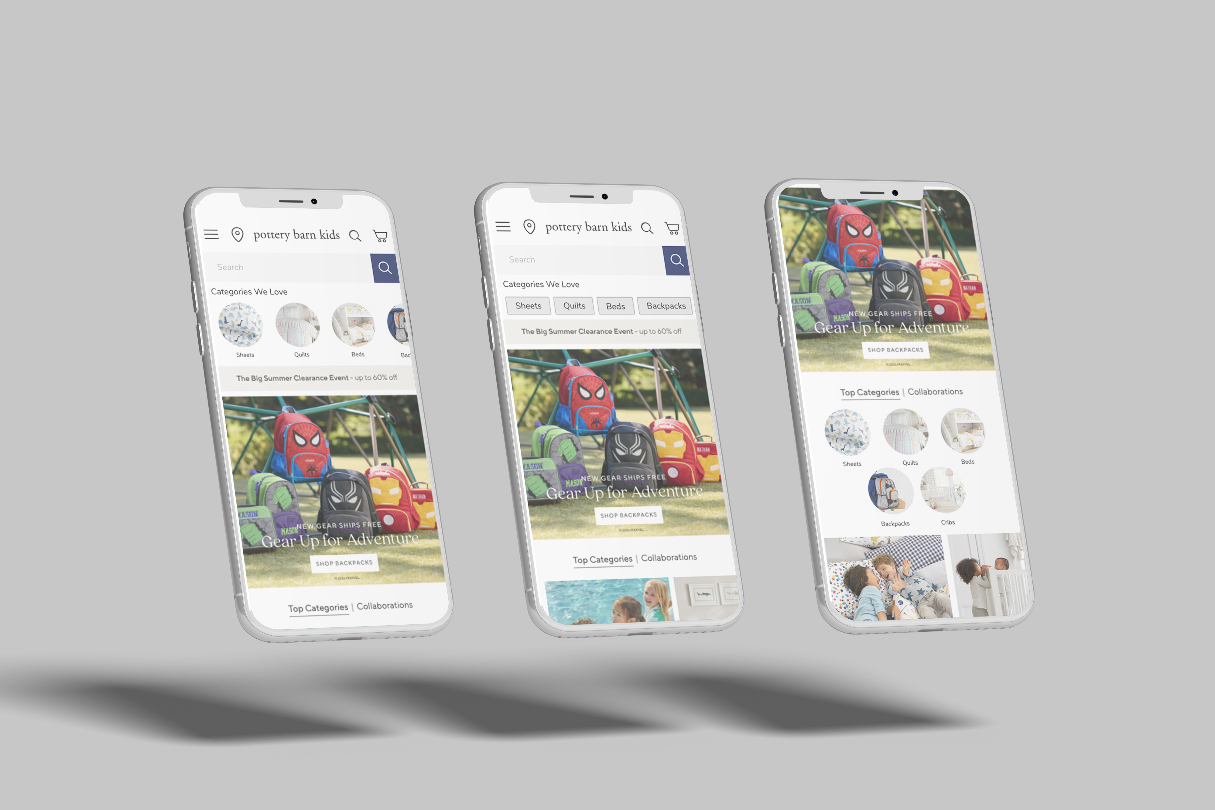
That question eventually got me pulled into a new initiative: a cross-functional A/B testing platform backed by the analytics team and a brand digital SVP. Pottery Barn Kids was chosen as the primary test bed. A strategically choice because it’s leadership, smaller footprint, and enough distance from the core portfolio to absorb risk. We could move fast and learn without consequence at scale.