


Fidelity
Increased fidelity between concept and shipped product by eliminating the traditional handoff gap.
RoleCreative Director
and UX Lead
Company
Deutsch IncYear2025
When Pathway Sports & Entertainment came to Deutsch, they had a mission, a team of licensing experts, and an article coming out in weeks. What they didn't have was a logo, a visual identity, a website, or an established brand voice. A separate agency was weeks into developing a wordmark. We were starting the website at the same time.
The brief was to build a marketing site that could speak credibly to college athletes, their agents, coaches, universities, and the press, simultaneously. For a company that was entering a space where trust was everything and exploitation was the status quo.
We had one month.
NIL licensing is fundamentally a trust business. College athletes are often entering their first commercial agreements while navigating a rapidly changing system. Pathway's value proposition was that they would approach those relationships differently: with transparency, fair compensation, and long-term thinking. The challenge was that every audience defined trust differently.
Athletes
Young, culturally fluent. Need to feel seen and protected, not sold to.
Schools & coaches
Institutional, cautious. Need legitimacy and compliance confidence before recommending to athletes.
Agents & reps
Professional, results-oriented. Need to trust Pathway as a credible operator with aligned incentives.
Press
Looking for a clear, quotable mission and a compelling founding story. Need the narrative fast.
I began with a competitive audit of NIL companies and adjacent industries where expertise and trust are central to the business model.
I looked at sports brands, talent agencies, venture capital firms, financial services companies, and media organizations.
The goal wasn't to identify visual trends to copy. It was to understand the expectations each audience would bring with them and determine which conventions were worth keeping and which were worth challenging.
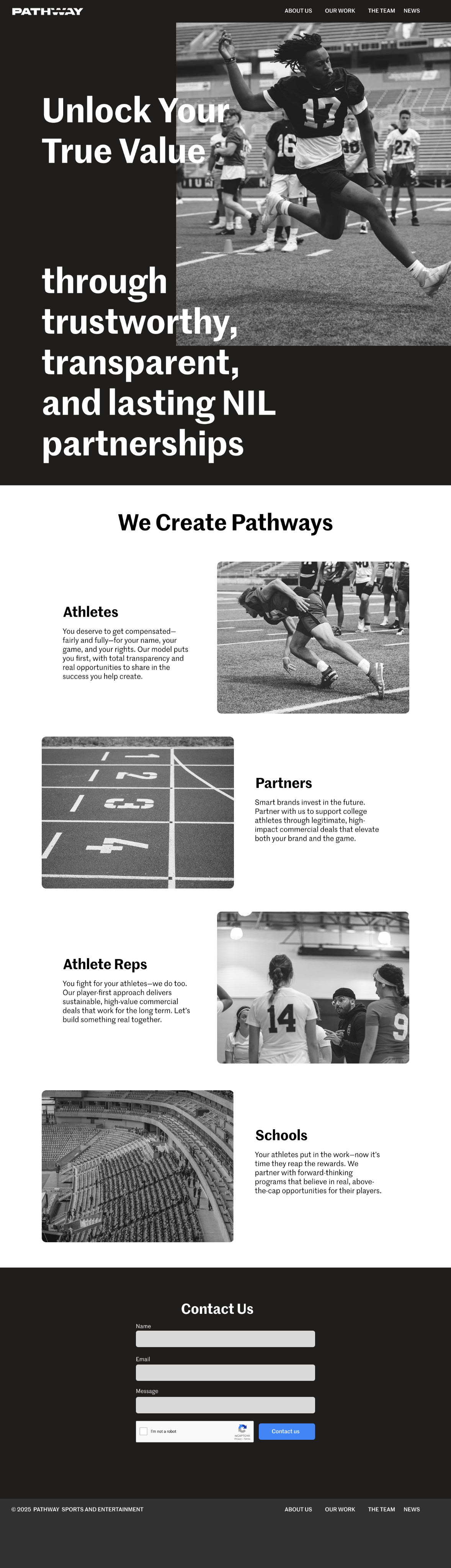
The first direction drew heavily from contemporary sports marketing. Bold typography. Photography-led storytelling. Motion designed to create momentum and excitement. The direction connected strongly with athletes but introduced a risk: it positioned Pathway closer to a sports brand than a trusted licensing partner.
The second direction borrowed less from sports marketing and more from organizations built on expertise and guidance. The inspiration came from venture capital firms, talent agencies, and advisory businesses that needed to communicate authority without becoming inaccessible.
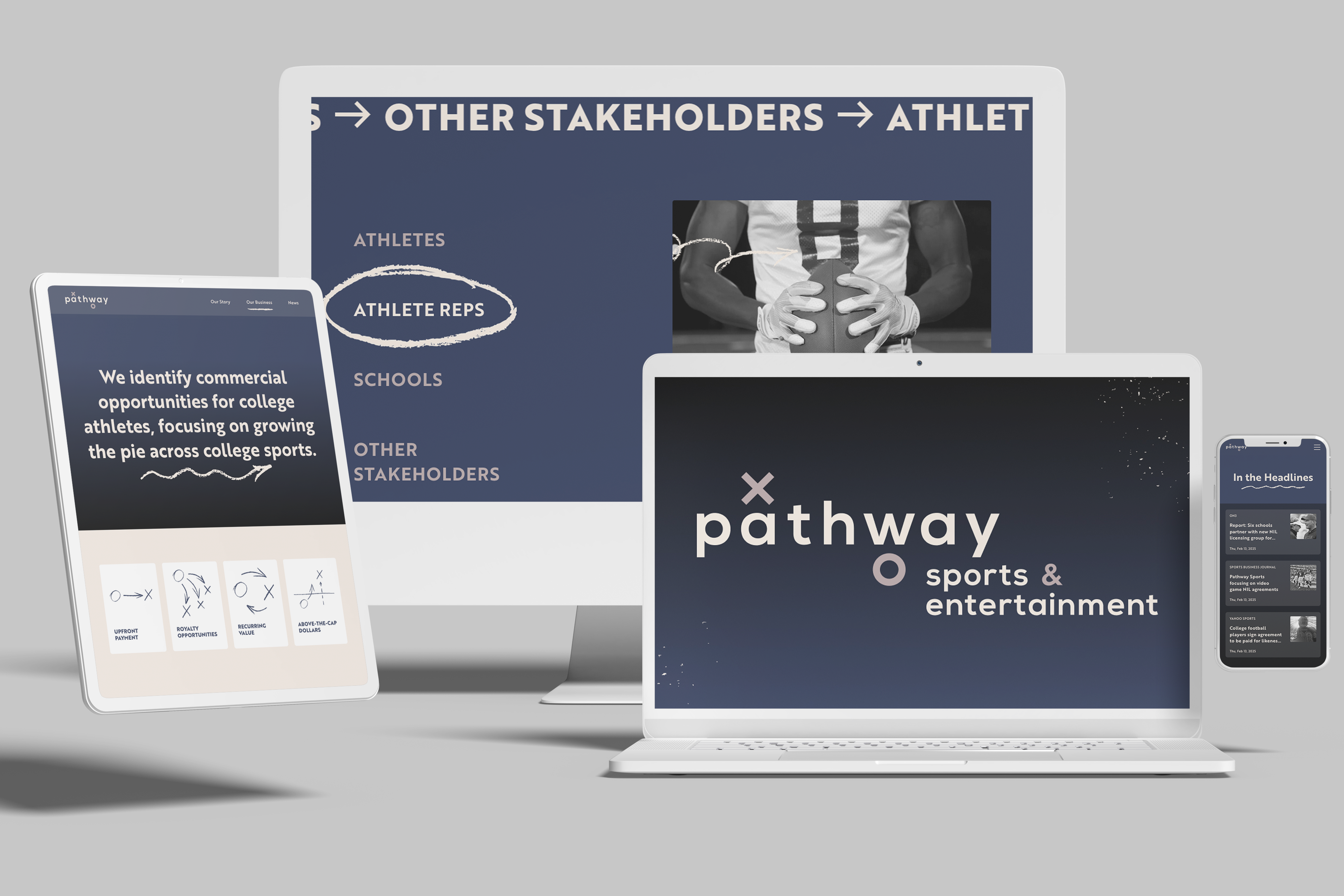
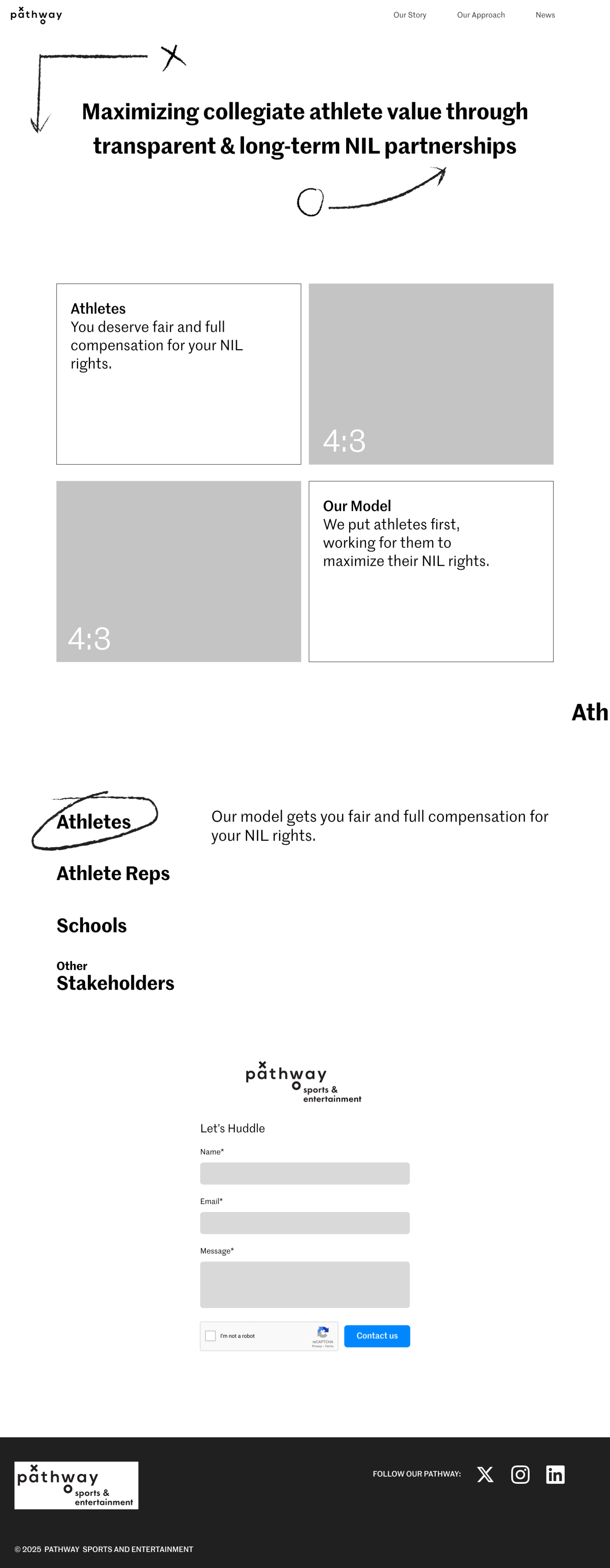
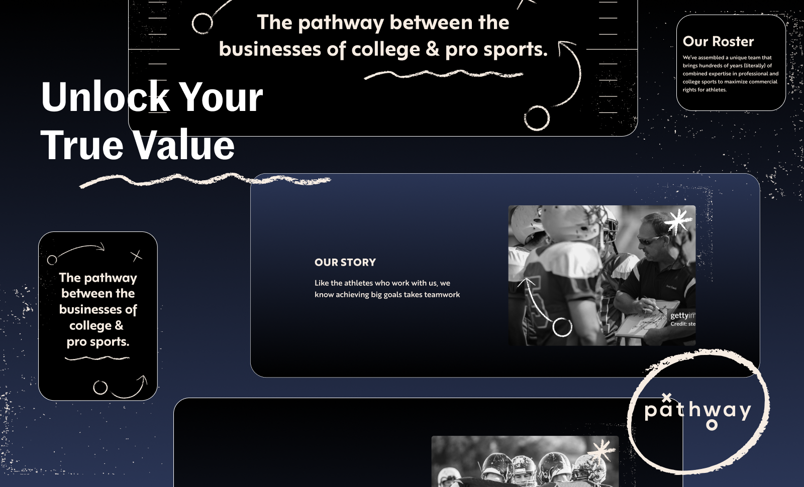
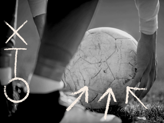
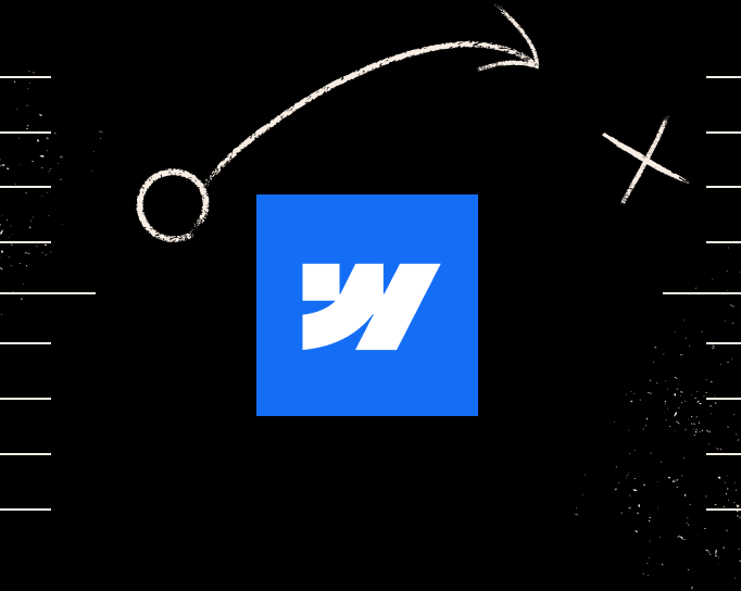
At the center of the concept was a simple metaphor: the playbook.
Hand-drawn routes, diagrams, arrows, and markings became the foundation of the visual system. The metaphor worked because it reflected Pathway's actual role. The company wasn't promising celebrity. It was promising a better plan.
The visual language didn't stop with illustration. Working closely with the copywriting team, we extended the playbook metaphor throughout the experience. Calls to action, section structures, and content hierarchy all drew from the same conceptual foundation. The result was a system where visual and verbal language reinforced one another. The site began to feel less like a collection of design decisions and more like a coherent point of view.
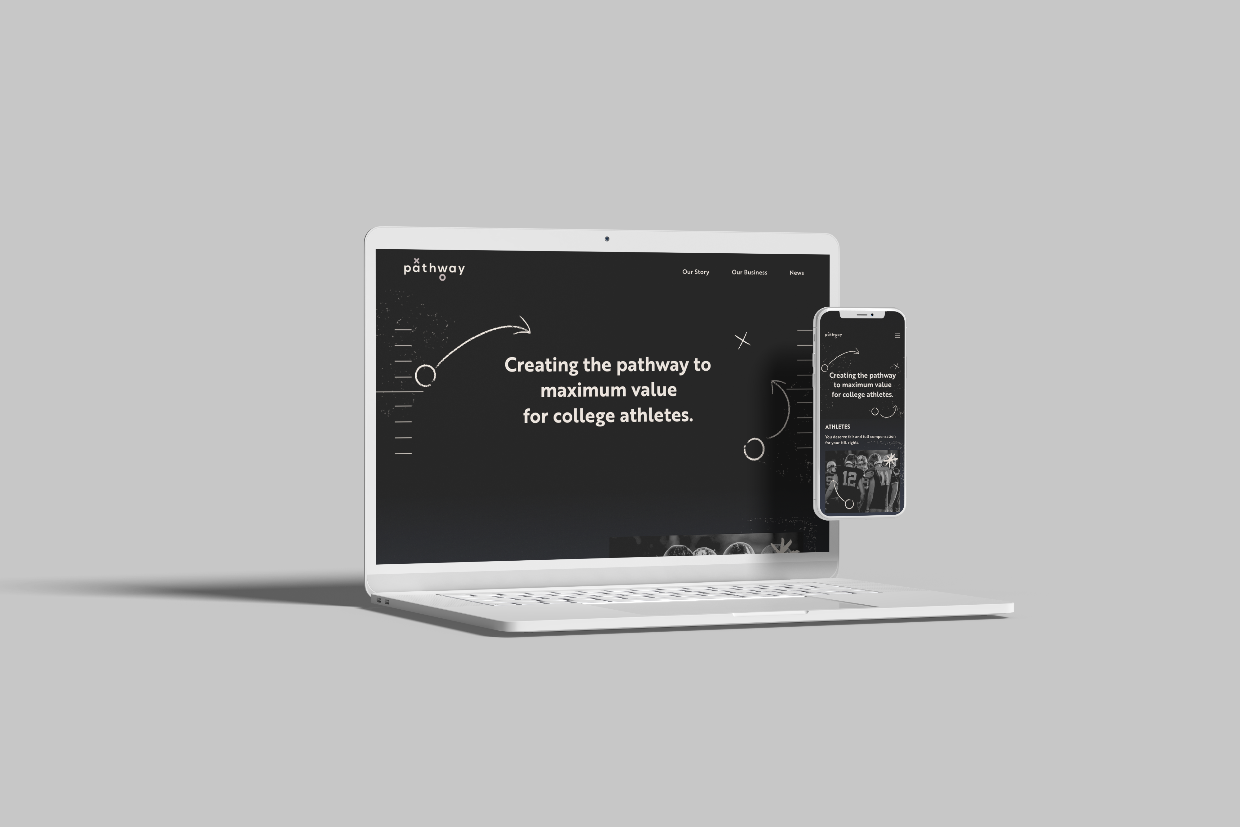
The defining element of the final experience became the playbook diagrams woven throughout the site. Routes, arrows, and formations animated across pages as if strategy were being drawn in real time. The metaphor earned its place. Pathway was literally offering athletes a better play. The diagrams made that promise tangible.
The illustrations began in Procreate before being refined in Illustrator and prepared for animation.
A vector-native solution would have been cleaner.
It also would have been wrong. The slight irregularities of a hand-drawn line introduce a human quality that perfectly smooth geometry can't replicate. For a company built around relationships and advocacy, that distinction mattered.
The goal wasn't polish. The goal was trust.
The project helped pioneer a leaner way of working at the agency. Instead of treating development as a downstream activity, we embedded a Webflow developer alongside the design process. This allowed us to test ideas in the medium itself, make decisions with implementation realities in mind, and preserve the integrity of the experience through launch. The value wasn't speed alone—it was a tighter connection between design intent and what ultimately shipped.
Increased fidelity between concept and shipped product by eliminating the traditional handoff gap.
Made interaction, motion, and implementation decisions in the final medium rather than in static deliverables.
Brought design and development together from the beginning, allowing the experience to evolve collaboratively.
The most interesting constraint on this project wasn't the timeline, it was the absence of a brand. Most designers work within an existing system, inheriting a visual language, a set of values, and a framework for decision-making. This project required creating that system while simultaneously creating the thing that would use it.
Without established guidelines, every design decision had to answer a larger question: what does a company that genuinely has athletes' backs look like?
Without established guidelines, every design decision had to answer a larger question: what does a company that genuinely has athletes' backs look like? The answer wasn't found in a logo or a color palette. It emerged through a series of choices about trust, expertise, and humanity. The hand-drawn lines, the playbook metaphor, the editorial photography, and the language all worked together to communicate a point of view. None of it was decorative. Each element served as an argument for why this company was different from every other organization asking athletes to sign something.
RoleCreative Director
and UX Lead
Company
Deutsch IncYear2025
When Pathway Sports & Entertainment came to Deutsch, they had a mission, a team of licensing experts, and an article coming out in weeks. What they didn't have was a logo, a visual identity, a website, or an established brand voice. A separate agency was weeks into developing a wordmark. We were starting the website at the same time.
The brief was to build a marketing site that could speak credibly to college athletes, their agents, coaches, universities, and the press, simultaneously. For a company that was entering a space where trust was everything and exploitation was the status quo.
We had one month.
NIL licensing is fundamentally a trust business. College athletes are often entering their first commercial agreements while navigating a rapidly changing system. Pathway's value proposition was that they would approach those relationships differently: with transparency, fair compensation, and long-term thinking. The challenge was that every audience defined trust differently.
Athletes
Young, culturally fluent. Need to feel seen and protected, not sold to.
Schools & coaches
Institutional, cautious. Need legitimacy and compliance confidence before recommending to athletes.
Agents & reps
Professional, results-oriented. Need to trust Pathway as a credible operator with aligned incentives.
Press
Looking for a clear, quotable mission and a compelling founding story. Need the narrative fast.
I began with a competitive audit of NIL companies and adjacent industries where expertise and trust are central to the business model.
I looked at sports brands, talent agencies, venture capital firms, financial services companies, and media organizations.
The goal wasn't to identify visual trends to copy. It was to understand the expectations each audience would bring with them and determine which conventions were worth keeping and which were worth challenging.
The first direction drew heavily from contemporary sports marketing. Bold typography. Photography-led storytelling. Motion designed to create momentum and excitement. The direction connected strongly with athletes but introduced a risk: it positioned Pathway closer to a sports brand than a trusted licensing partner.
The second direction borrowed less from sports marketing and more from organizations built on expertise and guidance. The inspiration came from venture capital firms, talent agencies, and advisory businesses that needed to communicate authority without becoming inaccessible.
At the center of the concept was a simple metaphor: the playbook.
Hand-drawn routes, diagrams, arrows, and markings became the foundation of the visual system. The metaphor worked because it reflected Pathway's actual role. The company wasn't promising celebrity. It was promising a better plan.
The visual language didn't stop with illustration. Working closely with the copywriting team, we extended the playbook metaphor throughout the experience. Calls to action, section structures, and content hierarchy all drew from the same conceptual foundation. The result was a system where visual and verbal language reinforced one another. The site began to feel less like a collection of design decisions and more like a coherent point of view.
The defining element of the final experience became the playbook diagrams woven throughout the site. Routes, arrows, and formations animated across pages as if strategy were being drawn in real time. The metaphor earned its place. Pathway was literally offering athletes a better play. The diagrams made that promise tangible.
The illustrations began in Procreate before being refined in Illustrator and prepared for animation.
A vector-native solution would have been cleaner.
It also would have been wrong. The slight irregularities of a hand-drawn line introduce a human quality that perfectly smooth geometry can't replicate. For a company built around relationships and advocacy, that distinction mattered.
The goal wasn't polish. The goal was trust.
The project helped pioneer a leaner way of working at the agency. Instead of treating development as a downstream activity, we embedded a Webflow developer alongside the design process. This allowed us to test ideas in the medium itself, make decisions with implementation realities in mind, and preserve the integrity of the experience through launch. The value wasn't speed alone—it was a tighter connection between design intent and what ultimately shipped.
Increased fidelity between concept and shipped product by eliminating the traditional handoff gap.
Made interaction, motion, and implementation decisions in the final medium rather than in static deliverables.
Brought design and development together from the beginning, allowing the experience to evolve collaboratively.
The most interesting constraint on this project wasn't the timeline, it was the absence of a brand. Most designers work within an existing system, inheriting a visual language, a set of values, and a framework for decision-making. This project required creating that system while simultaneously creating the thing that would use it.
Without established guidelines, every design decision had to answer a larger question: what does a company that genuinely has athletes' backs look like?
The answer wasn't found in a logo or a color palette. It emerged through a series of choices about trust, expertise, and humanity. The hand-drawn lines, the playbook metaphor, the editorial photography, and the language all worked together to communicate a point of view. None of it was decorative. Each element served as an argument for why this company was different from every other organization asking athletes to sign something.
In the end, the website did more than launch a business. It became the first expression of the company itself and helped define the visual language that the broader brand would eventually adopt.
RoleCreative Director
and UX Lead
Company
Deutsch IncYear2025
When Pathway Sports & Entertainment came to Deutsch, they had a mission, a team of licensing experts, and an article coming out in weeks. What they didn't have was a logo, a visual identity, a website, or an established brand voice. A separate agency was weeks into developing a wordmark. We were starting the website at the same time.
The brief was to build a marketing site that could speak credibly to college athletes, their agents, coaches, universities, and the press, simultaneously. For a company that was entering a space where trust was everything and exploitation was the status quo.
We had one month.
NIL licensing is fundamentally a trust business. College athletes are often entering their first commercial agreements while navigating a rapidly changing system. Pathway's value proposition was that they would approach those relationships differently: with transparency, fair compensation, and long-term thinking. The challenge was that every audience defined trust differently.
Athletes
Young, culturally fluent. Need to feel seen and protected, not sold to.
Schools & coaches
Institutional, cautious. Need legitimacy and compliance confidence before recommending to athletes.
Agents & reps
Professional, results-oriented. Need to trust Pathway as a credible operator with aligned incentives.
Press
Looking for a clear, quotable mission and a compelling founding story. Need the narrative fast.
I began with a competitive audit of NIL companies and adjacent industries where expertise and trust are central to the business model.
I looked at sports brands, talent agencies, venture capital firms, financial services companies, and media organizations.
The goal wasn't to identify visual trends to copy. It was to understand the expectations each audience would bring with them and determine which conventions were worth keeping and which were worth challenging.
The first direction drew heavily from contemporary sports marketing. Bold typography. Photography-led storytelling. Motion designed to create momentum and excitement. The direction connected strongly with athletes but introduced a risk: it positioned Pathway closer to a sports brand than a trusted licensing partner.
The second direction borrowed less from sports marketing and more from organizations built on expertise and guidance. The inspiration came from venture capital firms, talent agencies, and advisory businesses that needed to communicate authority without becoming inaccessible.
At the center of the concept was a simple metaphor: the playbook.
Hand-drawn routes, diagrams, arrows, and markings became the foundation of the visual system. The metaphor worked because it reflected Pathway's actual role. The company wasn't promising celebrity. It was promising a better plan.
The visual language didn't stop with illustration. Working closely with the copywriting team, we extended the playbook metaphor throughout the experience. Calls to action, section structures, and content hierarchy all drew from the same conceptual foundation. The result was a system where visual and verbal language reinforced one another. The site began to feel less like a collection of design decisions and more like a coherent point of view.
The defining element of the final experience became the playbook diagrams woven throughout the site. Routes, arrows, and formations animated across pages as if strategy were being drawn in real time. The metaphor earned its place. Pathway was literally offering athletes a better play. The diagrams made that promise tangible.
The illustrations began in Procreate before being refined in Illustrator and prepared for animation.
A vector-native solution would have been cleaner.
It also would have been wrong. The slight irregularities of a hand-drawn line introduce a human quality that perfectly smooth geometry can't replicate. For a company built around relationships and advocacy, that distinction mattered. The goal wasn't polish. The goal was trust.
The project helped pioneer a leaner way of working at the agency. Instead of treating development as a downstream activity, we embedded a Webflow developer alongside the design process. This allowed us to test ideas in the medium itself, make decisions with implementation realities in mind, and preserve the integrity of the experience through launch. The value wasn't speed alone—it was a tighter connection between design intent and what ultimately shipped.
Increased fidelity between concept and shipped product by eliminating the traditional handoff gap.
Made interaction, motion, and implementation decisions in the final medium rather than in static deliverables.
Brought design and development together from the beginning, allowing the experience to evolve collaboratively.
The most interesting constraint on this project wasn't the timeline, it was the absence of a brand. Most designers work within an existing system, inheriting a visual language, a set of values, and a framework for decision-making. This project required creating that system while simultaneously creating the thing that would use it.
Without established guidelines, every design decision had to answer a larger question: what does a company that genuinely has athletes' backs look like?
The answer wasn't found in a logo or a color palette. It emerged through a series of choices about trust, expertise, and humanity. The hand-drawn lines, the playbook metaphor, the editorial photography, and the language all worked together to communicate a point of view. None of it was decorative. Each element served as an argument for why this company was different from every other organization asking athletes to sign something.
In the end, the website did more than launch a business. It became the first expression of the company itself and helped define the visual language that the broader brand would eventually adopt.